Soul Forge
Soul Forge is a Tabletop Role Playing Game the utilizes stats, dice, and player ingenuity to face challenges, create narratives, and forge experiences with a group of friends. It does this through easy to grasp mechanics that are used as building blocks to represent characters and their unique qualities.
My role as Creative Director has required me to don many hats and utilize many skillsets to continue the development of Soul Forge as a cohesive system and Product some of which are outlined below:
Game Developer
Graphic Designer
Web Developer
Software Developer
Project Manager
Spreadsheet Specialist
UX Specialist
UI Designer
Author
Illustrator
Editor
Soul Forge Cover Art by Jue Li
Brand Exploration
Because this genre is steeped deep within mystical fantasy we needed something that evokes that feeling of whimsy and fanciful possibility that didn't seem too childish. We wanted it to also be able to facilitate strong emotional narratives that push characters to their limit, so an element of mystery and darkness was needed.
Most tabletop rpgs trend for a more gritty style, grounded in the roots of Lord of the Rings by J. R. R. Tolkien, but we wanted something more idyllic and clean for a modern audience. We chose to stray away from harsh dirty textures in favor of a sharper, more magical and smooth presence of grounding to the imagery.
Soul Forge itself is about the characters' journeys and how they develop over time, with each event and challenge they face changing them in some way, much like how people in real life are changed and shaped by their own experiences. To reference this we chose to go with the concept of forging characters' souls as these core moments always hit with a substantial emotional impact, much like a hammer on steel making the resulting blade stronger with each stroke.
That motif decided, we were worried about leaning into actually showcasing a hammer or anvil, as those are abundantly common in the fantasy space and wouldn't stand out among the rest. After much deliberation we settled on a phoenix. This mythical creature of rebirth and change served well an abstract reflection of a soul, tied into the fiery qualities of forging, and leaned into the mystical and magical direction we wanted for the system's feel.
Continuing with the need for fire, and searching for something to more represent the souls I envisioned the use of embers, floating gently, providing a sense of light, warmth, and certainty to the unfamiliar mysticism and variability of magic.
To further bring in the magical design aspect I decided to try and bring in a simplified magical rune design. It needed to be sharp, to feel more modern, and to not feel too out of place in a more sci fi setting in the future, so I knew we needed simple, geometric accents.
This left me with a few key notes when designing the branding.
- Whimsical and Fanciful, but allowing for darkness and mystery.
- Clean and magical
- No anvil or hammer
- Evocative of magic and fire
- Use of embers/ souls
- Simple runes
- Largely dark with bright, colorful highlights
Research and Reference
Before starting on the brand I looked for inspiration from established brands in the fantasy space the leaned away from the grittier nature of what would be Soul Forge's main competition and leaned into the magic and mystery we needed. The brands that I took inspiration from were:
- Final Fantasy
- Kingdom Hearts
- The Legend of Zelda
- Runeterra
- Star Wars, Fallen Order
I also looked at a lot of general fantasy art, to try and get the feeling of the idyllic fantasy we needed.
The Palette and Embers
Very quickly I knew we needed something that felt like a spark, or a start to something. I wanted a darkness, lit distantly by a fire that gently emanated the embers. We needed a gradient that can be composed of the brand's colors. I also knew I'd need a brighter color that could work for the "paper" coloration that nearly all ttrpgs use for their book and is a staple of the genre. This meant I needed a light, off white color (that didn't seem to faded to avoid the "worn" feeling), a strong red for the fire and as an eye catcher, and a darker cool color to provide the mystery, and some contrast to the otherwise burning hot palette. After some fiddling I realized I was going to need more colors in the gradient. This lead to the addition of an orange for the logo to bring it up, and for the embers, to give them a warmer less irritating presence on the dark background. After that I had the forge's fire and the mystery but I was still lacking the magic...
Magic is most commonly depicted in games with the color blue. This is mostly seen when mana, a common ephemeral resource used to produce magic in the same way wood might be used to produce a fire, is visible in a potion or within magical sparks. I did have a dark blue already contrasting the fire, but it was too dark. Adding a lighter blue would make the palette too cool and confused. I needed something else that could be bright and warm, but not too hot. This lead me to purple a color that rarely appears in nature. It evokes a sense of rarity and mystery and as the historical color of royalty also carries with it a sense of distinguishment that naturally feels cleaner and of higher value. I picked a purple out of the gradient and pulled it brighter. This resulting redish purple ended up taking the key color spot from the red and became more present in the light themed designs. This side effect also caused the general pages of the book to look more unique from the most popular ttrpg's pages, which use red for the headers.
The Book
The book is the most important part of the system. This will be what potential customers will see in stores and what players are going to be going through countless times over the course of their play sessions. What the book looks like will be what people most strongly associate with the brand, regardless of any other visual sources so it needs to also encompass all of the branding needs and setup and important motifs we want to use in the future for a more mixed media approach.
Chapter Heads
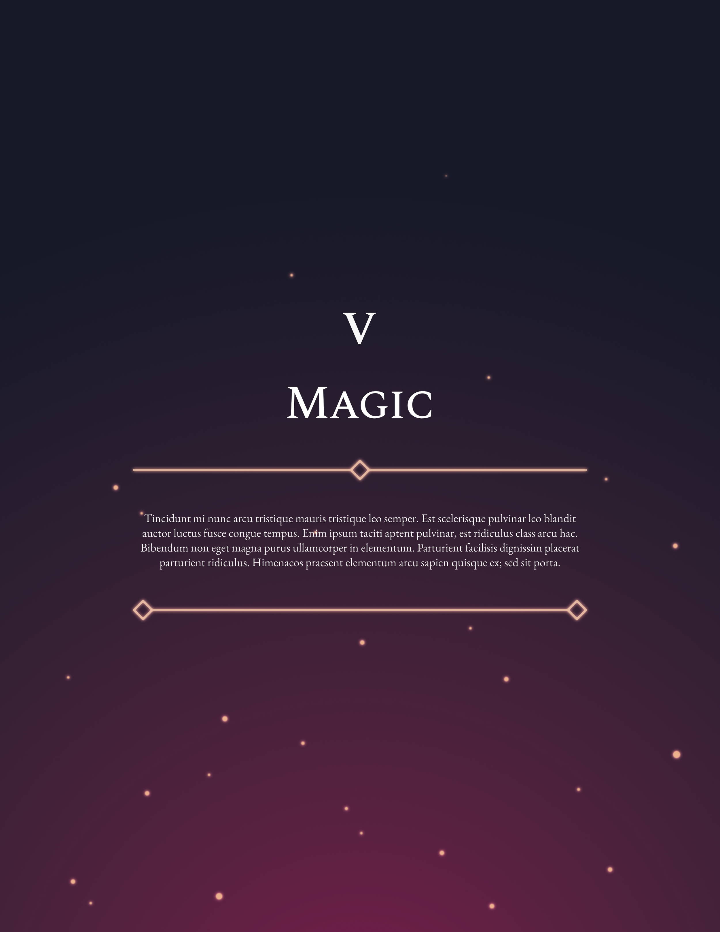
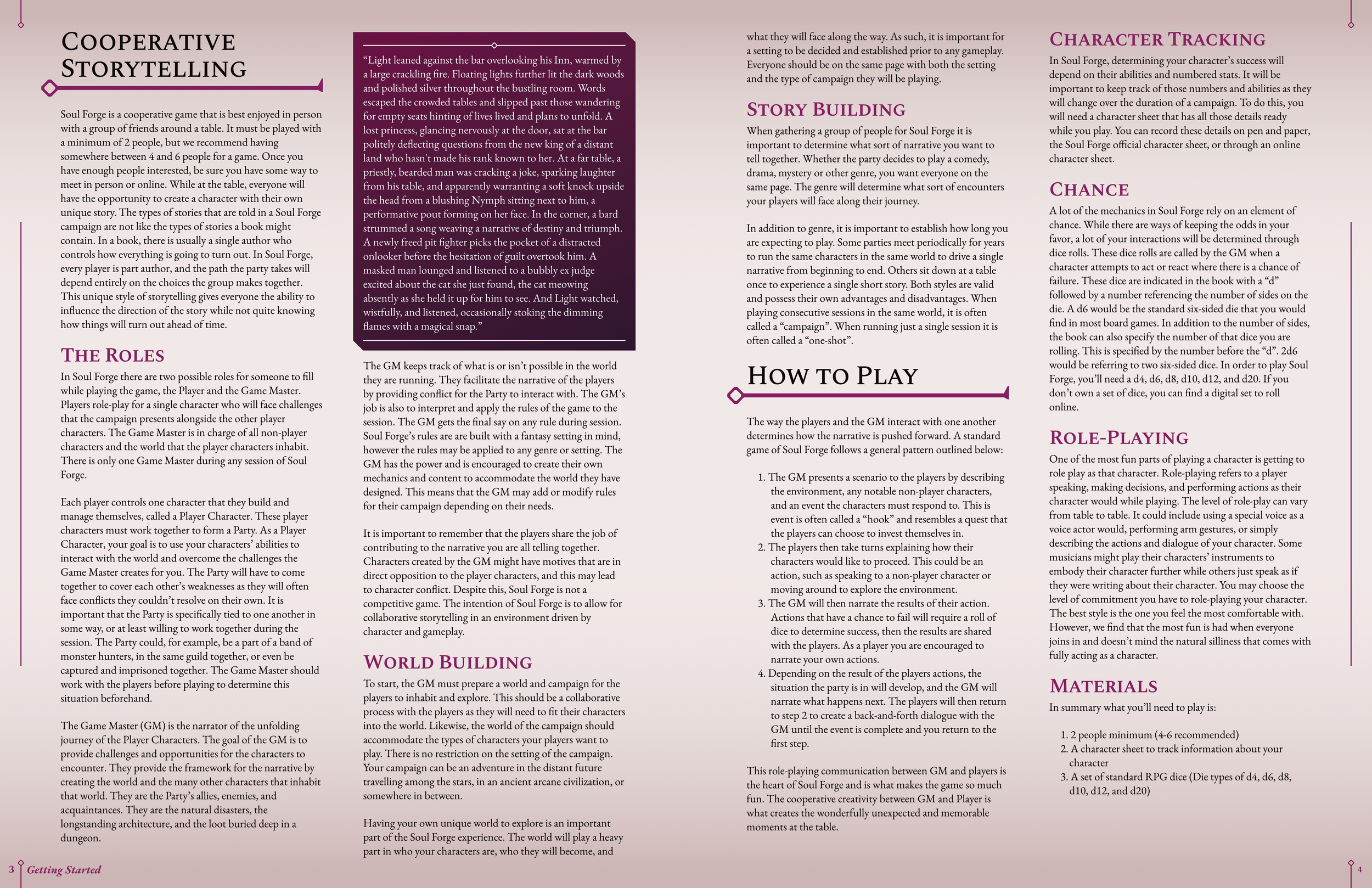
For the chapter heads, we needed something that stood out from the standard pages so they would be easily recognizable while flipping through the book. Most RPG books would rely on art to make that happen, but unfortunately we didn’t have the budget. We had to rely on pure design to have these pages stand out. After some trial and error I finally settled on using the brand gradient and embers, which at this point hadn’t been present in the book, only on the website. To help the body text of the chapter page stand out, I set up some framing decorations that are inspired by simplified versions of the logo underline, and the header decorations. I gave the decorations the same glow as the embers to help ground the text into the design further, and was happy with the result.
Page Trappings
For the main pages we wanted something that felt like an RPG book but didn’t carry the same grit that most rely on, with paper textures and printed smudging. We also didn’t want it to feel too sterile, or without some “grounding” to it. My solution was to use a simple gradient to give the page a bit of color and depth without adding any legitimate texture. I bent the darker color into the purple and red the rest of the book and branding used to help the whole thing feel more cohesive.
As mentioned before, we had already been using Spectral SC in our Google doc version of the book so we continued that here. I decided to make a variation of logo decoration using the diamond and serifs to underline the headers. Originally I also had a smaller version, with the diamond reduced compared to the line thickness and solid, that was used for sub heads but that ended up making pages far too busy. With the sub head decorations removed, the sub heads took on the purple color to stand out more.
I also wanted something to attach the page number and chapter reference to, so they wouldn’t just be floating in the corner. Leaning more into the rune design, and wanting to establish the diamond more, I made a simple decoration to sit between them. The mirror decoration on the tops of the pages, and the lines between, were added to extend the presence of the decoration and frame the pages without making them too busy, and to further drive home the slightly runic vibe we wanted to be present.
Finally, we needed a callout box, something that could hold text for Shards (discussed further below). They needed to fit inside text columns and have easily expandable designs with signifiers for the start and end of each, so if one needed to reflow from one column or page to the next it could. After some tweaking I settled on the dark gradient design with cut corners. The gradient calls back to the embers’ background and provides a nice pop of color against what would otherwise be a pretty bland page. The chapter head decorations were repurposed as the start and stop signifiers for the shard further integrating the box into the branding.
Dense Information
Soul Forge gives players many many options for character customization with 7 Attributes, 28 Skills, 100+ spells, 200+ items, and 1000+ abilities (we call edges), leaving us with a lot of information to organize and present. To make it more difficult, all of these had just a bit too much information to reasonably fit into a table. Then, even if we did use tables, we would lose out on many opportunities for art and shards due to the table’s rigidness. I needed some way to make these quickly scannable and digestible, so players wouldn’t spend too much time getting lost and reading over parts of the system that don’t pertain to them or their character. I settled on using these card suggestions, with simple lines dropping from the name of the spell, item, edge, etc. This made the beginning and end of each element immediately recognizable without cluttering the page. It also allowed more free flowing of the text through the pages, which left room for art and shards.
Berserker Illustration by Jue Li
Narrative Shards
The Problems
We decided very early on in development that Soul Forge and its rules would be presented without any additional descriptions or flavor with the rules and building blocks so that players could inject their own in game representations for the mechanics they’re using. While some systems may give a spell that hurls a fireball to deal damage to a target, Soul Forge simply provides a succinct damage spell that could be represented by a fireball, a beam of light, or anything else. While this lets player imaginations run free and reach fruition in the game it can leave the system feeling a bit barren itself and without personality. It can also leave some players a bit lost on how they should be flavoring their mechanics or what they can consider for their own characters reflections of these mechanics in the world. Most books would use art to give the player something to chew on and consider when thinking of their own character, as well as break up the textbook like presentation of rules which can run dry after a few pages, but because we didn’t have the budget for more art we needed another way to inject this flavor without getting in the way of the rules.
The Solution
My solution were what I call Shards, little glimpses into the lives of the characters that we’ve played ourselves while testing the game that showcase different aspects of the system within the world of the game instead of just as gameplay mechanics. They could be presented in decorative boxes that reinforce the branding, add a bit of color, and give a little nod to the development team’s own adventures in game. Once I had the idea, I needed to know what these shards really needed to be.
Shard Anatomy
Firstly, they needed to be short, taking up no more than half a page at most when put within a column. Because Soul Forge is so character driven, they also needed to be personal and intimate to the character being focused. They also needed to carry the feel of Soul Forge: whimsical, fantastic, magic, and emotional. Finally, shards also needed to have an additional focus, that being the mechanic or concept being highlighted. These little windows into greater narratives had to do a lot of work in a very short amount of time.
I chose to write these similarly to a novel in third person to mimic the novels that inspired the genre. I use a mixture of strong, direct establishing sentences to quickly define context and use more loose or thought provoking lines to urge the reader to fill in the gaps themselves as they glimpse into fragments of possible realities they could explore. The lines between are focused on giving the reader a sense of experience with the mechanic themselves through visual and emotional queues rather than through numbers and definitions.
A few of the work in progress shards can be read below.
The Character Sheet
The character sheet is where players will store their character’s information and stats. How players choose to manage their character is largely up to them, many choosing their own methods outside those provided by the RPG systems they play. That said, Soul Forge intends to provide multiple official options for managing character information.
Pen and Paper
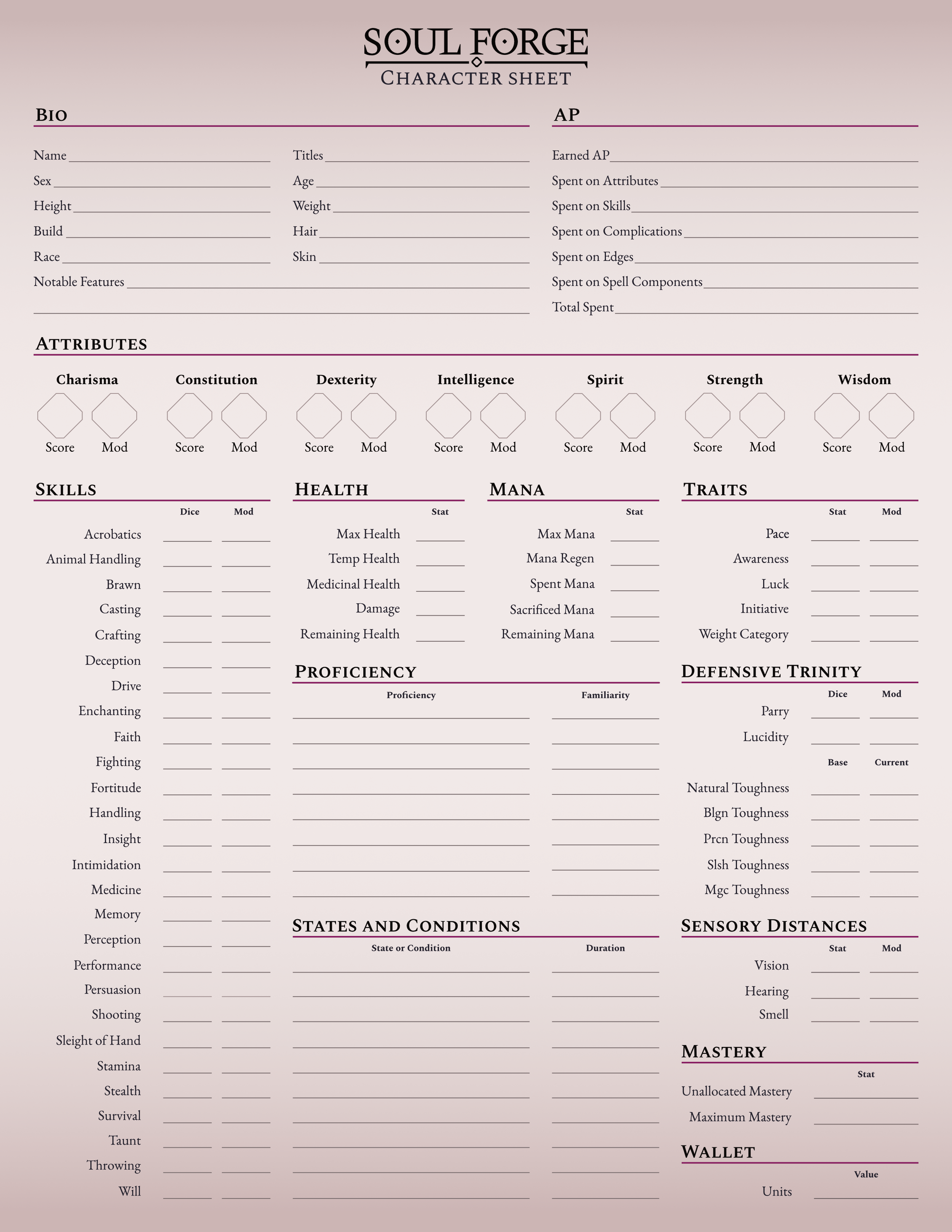
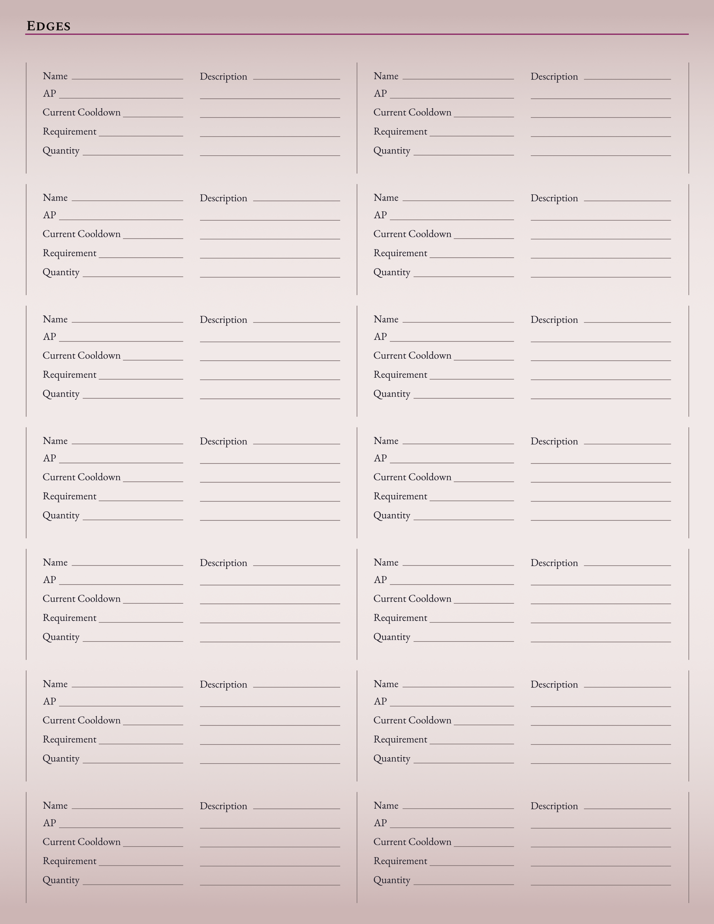
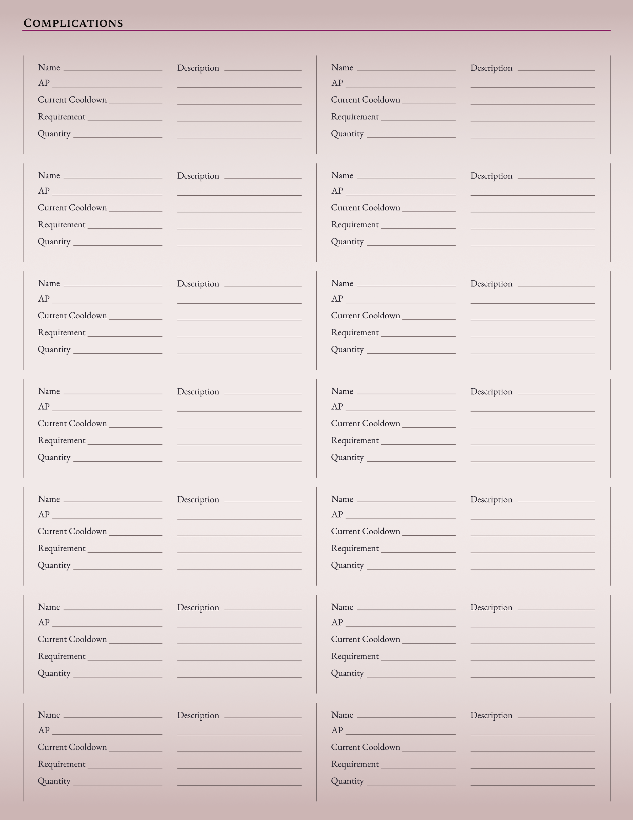
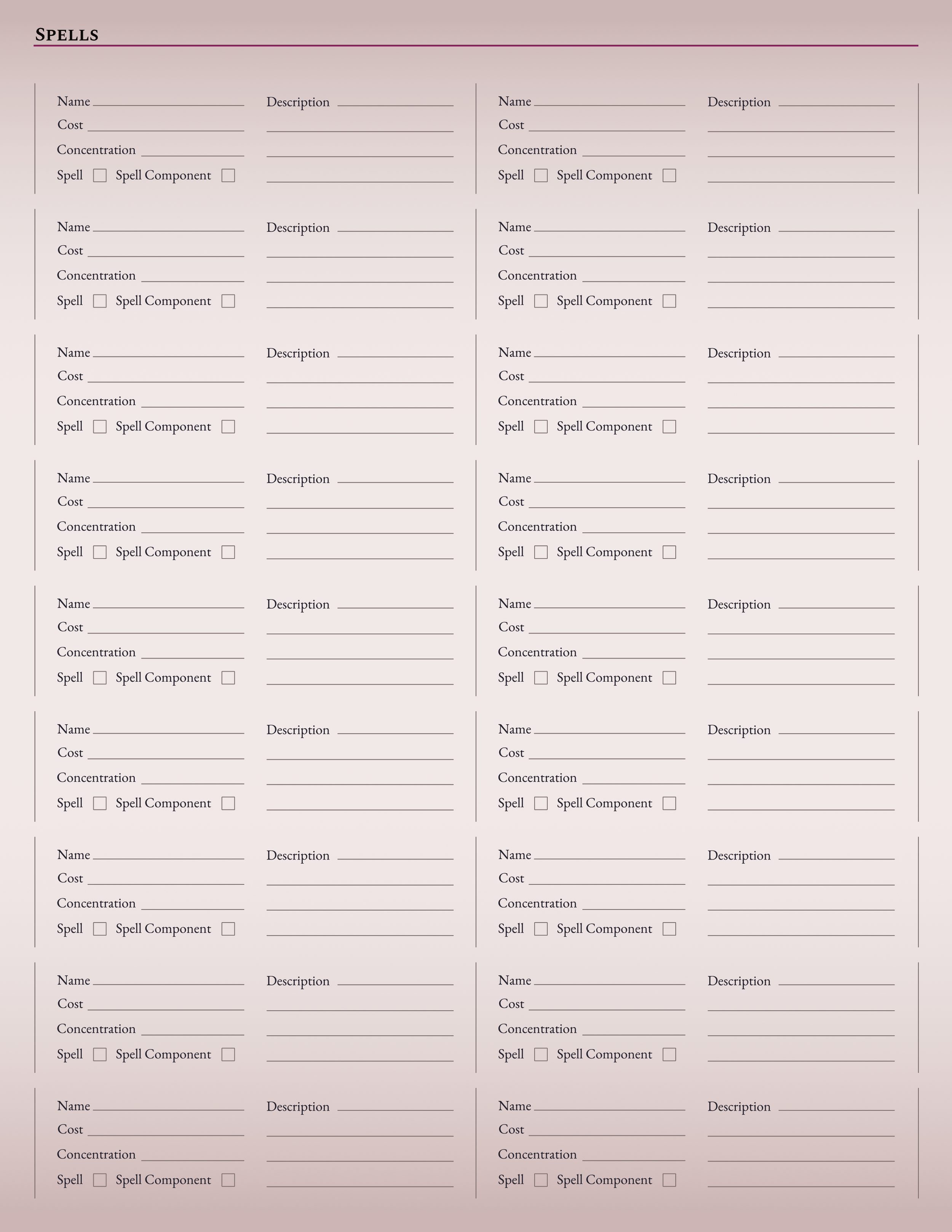
The paper character sheet is the standard sheet. Some variation of this is used for nearly every TTRPG system and finds it roots in when games were played exclusively through analog resources. Because your character’s build is up to you, we aren’t able to anticipate the number of edges, complications, spells, and items you’ll be carrying throughout your adventure. This means a paper character sheet needs to be expandable and adapt to each character as they develop and grow. Our solution to this was having a main page with all the information that is required of all characters. Anything else that was optionally expandable was given its own sheet that you could print as they become needed.
Design wise, we wanted these to be simple. They shouldn’t distract you from the game, and need to be easily readable. Because of the sheer amount of information that needed to be conveyed, I laid everything out like a form, with long lines to accommodate larger handwriting if space permitted. Sections are highlighted by the brand’s purple to make sections easier to distinguish.

Digital
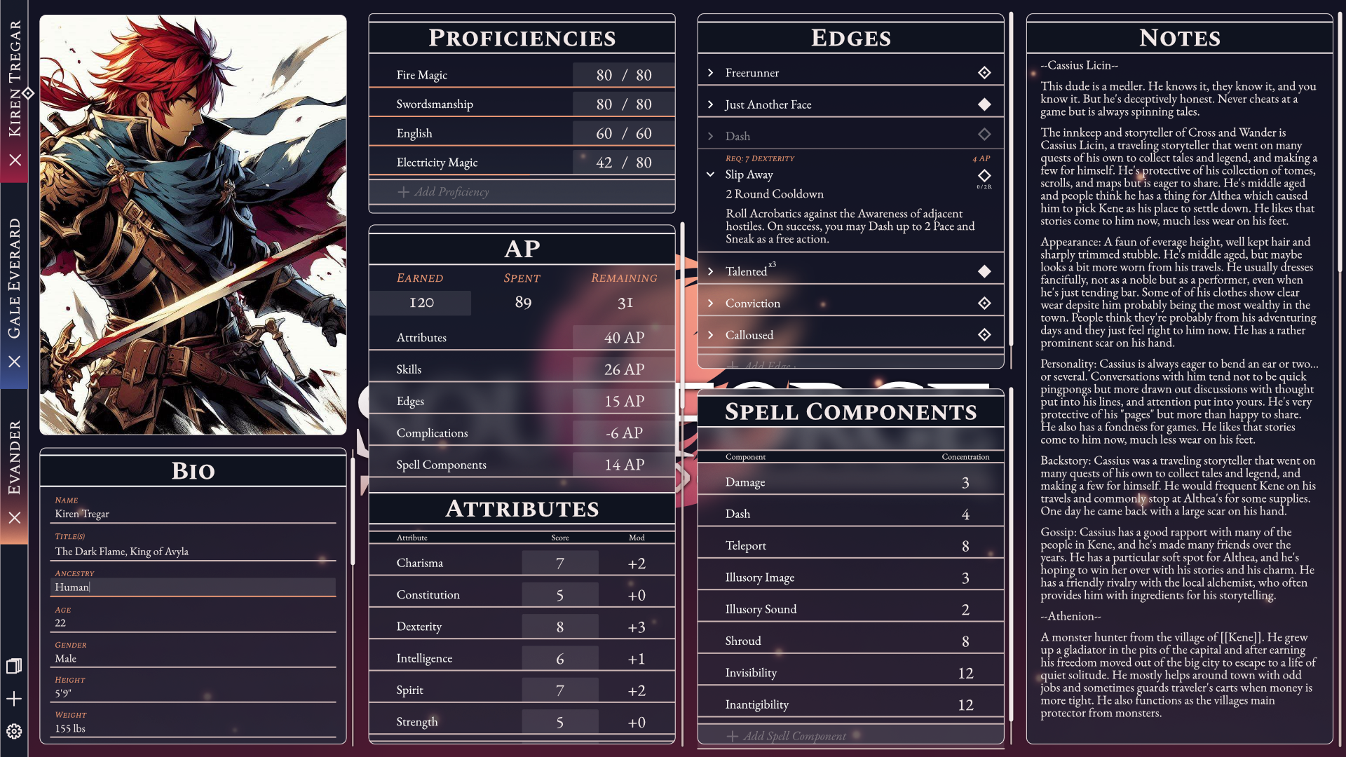
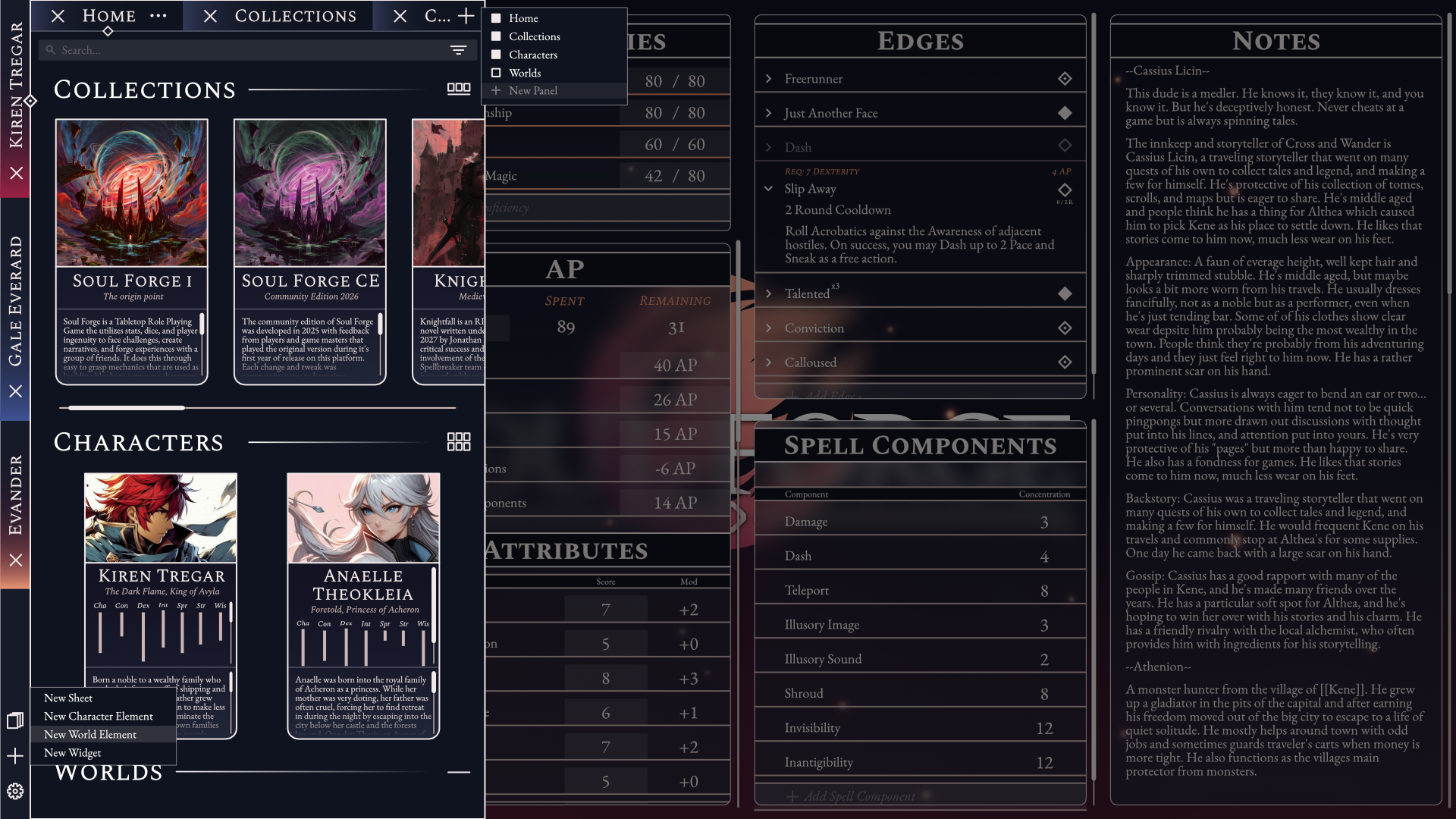
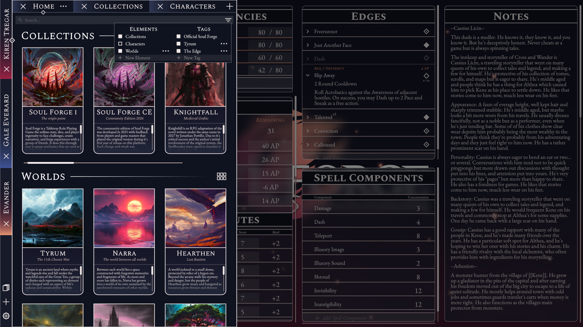
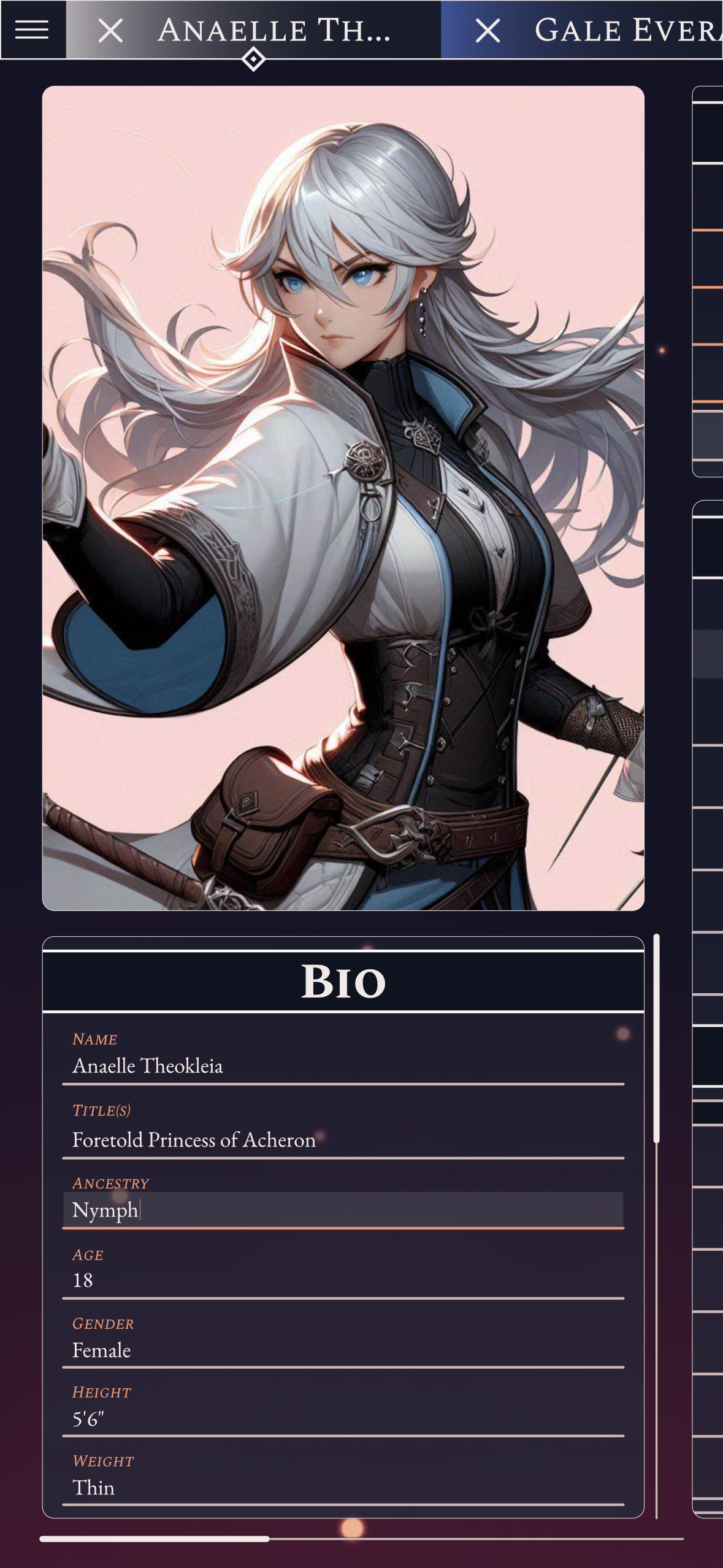
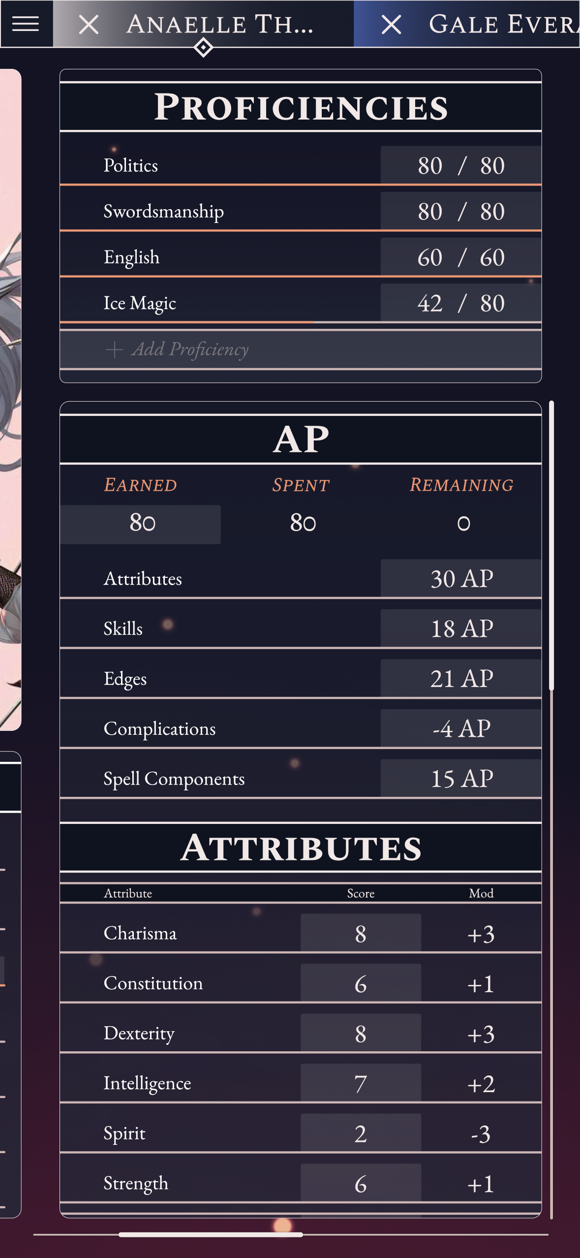
Work on the digital character sheet hasn’t been completed, but I still have some work in progress mockups that I can show. The goal for the app is to allow users to create their own layouts for the app, dropping in widgets for different aspects of their character and being able to drag around and resize them as they wish, so each sheet best shows the information they need for their character. A secondary goal of the app is to allow players to create their own content that can be stored and shared in Collections. The final goal is to provide Game Masters with a way to write and organize the worlds they build for these games, as well as share bits of them with their players as they uncover more throughout the campaign.
Spreadsheet
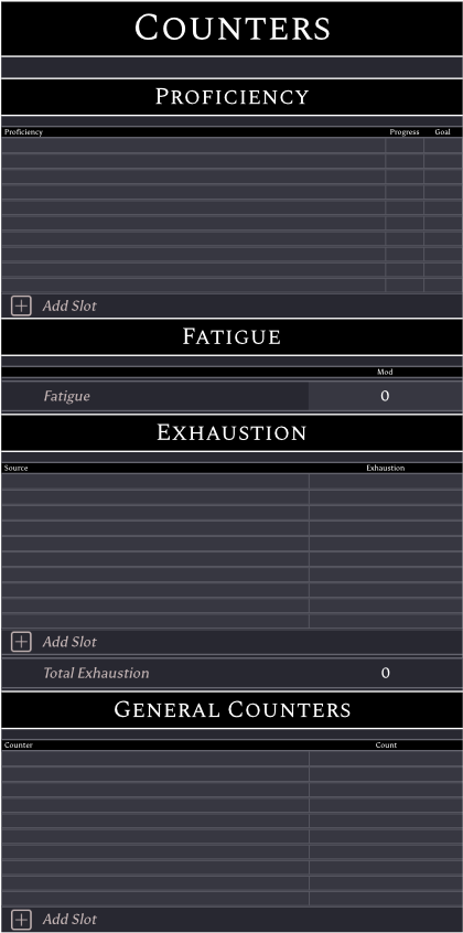
For development, we needed something I could make faster than a full app. I originally set up a spreadsheet that simply had spaces for the needed information, but as we continued testing the game, I slowly made the user experience easier and more pleasant. Some of the changes I made over time were:
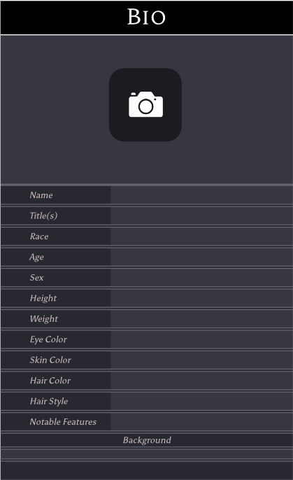
A place for non gameplay information, such as name, age, background, and a picture.
Dark mode color scheme because testers preferred it
Automatic calculation of dependent stats to cut down on mental math
Small gameplay tools for common at-the-table calculations to cut down on mental math
Tooltips to explain various stats for quick reference
Context driven roll modifier display to cut down on scrolling through the sheet
Spell construction calculator to cut down on complex math
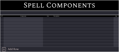
Automatic detail population of elements such as edges, complications, and spell components to cut down on rewriting the details of these elements
A global sheet that all sheets pull from to keep updates to populated information consistent across character sheets
A button to expand element slots for edges, complications, spells, and spell components while retaining population functionality
Conditional formatting that highlights and warns of potential errors when building a character
Dropdowns and typed search for elements to cut down on typos failing to populate data and easier information entry
A reformatting of the sheet to restrict it to thinner widths per section so it could more easily be viewed on mobile
A reference sheet for the Game Master, the person who runs the game, from all the players’ character sheets to quickly reference things like health, mana, and other resources without needing to bog the pace of gameplay down by asking.
Complex inventory management to track current carry weight, equipped items, their effects, and the total value of the inventory
Custom element sheets for players or game masters to add non-official edges, complications and spell components in a format that can be easily shared and integrated into the functionality of the sheet to facilitate development and testing of new content.
